A brand is usually recognized by its logo. The Logo is a representation of any organisation, vendors and its owner’s mindset. When we see a logo we know, we subconsciously trust those brands. That’s why designers work hard for extended periods at creating a simple and easy to remember logo. A good logo should also convey a hidden subtext.
Our own logo, Bunjy has a triangle as the superscript dot – Triangles are known symbols of enlightenment and progress.
In this blog, we will discuss the hidden secrets in the logo of the brands that are known worldwide.
1. Hyundai
Hyundai is one of the largest automobile manufacturers in the world. When an automaker designs its official logo to brand its vehicle, advertisements and documents, a lot of thought have to be put into that symbol that will represent the company.
If you take the Hyundai logo you see an Italicised H. Now, you might be wondering exactly what secrets can the letter H hide?
The logo is slanted to differentiate itself from Honda’s logo

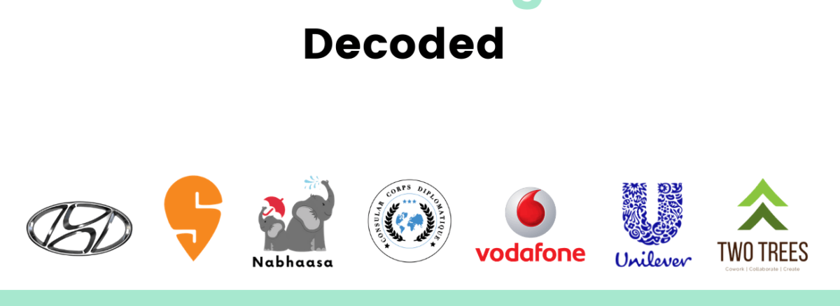
The logo is not only H, it is also a stylish silhouette of two individuals shaking hands. One Individual is the company representative and the other is a satisfied customer.

Their exchange is a handshake of Trust and Satisfaction between customer and company and also notice how the H is slanted forward, actively to the right, rather than passively to the left, and Oval of the figure indicates Hyundai’s global expansion in the worldwide market.
While the Hyundai logo hasn’t gone through the transformation that other brands have endured, it still an indication of what the company stands for.
2. Swiggy
Swiggy is one of the food delivery apps in India founded by Mr. Sriharsha Majety in the year 2014. Without going deep into the company profile we will see what are the hidden context of the Swiggy.

The logo shows that it is a letter and word centric logo with elongated letter S in orange colour. The orange colour gives high ambitions, energy, zeal, and extreme enthusiasm
The white colour is the planet of imagination and calmness, it states that the organisation works with a good combination of planning and fast action
And when you have an overall look of the logo, it looks like a GPS location, which describes that Swiggy can reach anywhere as per the customer preference
3. Nabhaasa
Nabhaasa is a swaddling cloth manufacturing and selling company from India with a global presence.
Its logo may look simple but holds many secrets. Let’s address them.
Can you explain the feeling that the first rains bring to you? The smell of the earth and trees? The joy and laughter? That is what ‘Nabhaasa’ means, the first rains of the season and what it feels and means to you.

It is much like explaining the feeling of joy of having a newborn in your life. The way your heart overflows with emotions you never experienced before especially as the feelings are different with each newborn baby.
Nabhaasa was started by two mothers who felt these surging emotions and wanted to share their passion for the love for their children and the love for our planet. Coming from India, a country steeped in culture and tradition, where newborns are given oil massages every day for 40 days and new mums are pampered in their maternal homes, meeting families and new relations. The one common factor that all homes with newborns have is swaddling. Indian mums, like all mums, know the joy of having a happy and satisfied baby. Especially one after a massage, bath and then a good sleep.
4.HCCD
The Honorary Consular Corps Diplomatique (HCCD) – INDIA is mainly formed to promote and strengthen the understanding between Honorary Consular officers in and outside India. It is founded by Hon’ble. Dr. Bhai Mohan Singh, Former Honorary Consular General of San Marino in India.

While taking an organisation to an international level, the logo also has to look and feel international. While designing the logo for HCCD India, they have used a combination of the below symbols to emphasize the values and pillars of the esteemed organisation of exceptional personnel.
Wreath symbolising the victory of endeavours undertaken
Globe to showcase the international reach and impact created by HCCD
Stars to indicate harmonious collaboration representing different nations
5. Vodafone
Vodafone is a British mobile operator and one of the largest mobile operators in India. The logo of Vodafone reminds many people of an earpiece, but if you take a look closely, it is simply a quotation mark.

The open quotation mark is to denote the start of a conversation. The brand plays up the logo implying that users can talk to each other anytime when they have Vodafone.
6. Unilever
Unilever is a British-Dutch consumer goods company. Unilever has several sub-brands that people use in their daily lives.

The Unilever logo is just a U, but when you look closely the U is made up of 24 icons, each one represents a core value of the enterprise or you can take it as the product line up. Its brand identity has been developed to bear the idea and aim of the company – to add vitality to life
Here are some of the essential icons of Unilever
- Sun
- Flower
- Hand
- DNA
- Hair
- Sauces
- Bird
- Container
- Frozen
- Recycle
- Wave
- Lips
- Palm Tree
- Spoon
- Bowl
7. TwoTrees
TwoTrees are a series of flexible workspaces in Chennai to accommodate the varied requirements of a cross-section of working professionals.

The logo is represented by two green triangles that symbolises growth, doubly so as green and triangles also denote progress.
What are some logos that you find interesting? Let us know in the comments below.
Looking to create your own logo? Our team of designers at Bunjy are here to help. Reach out to us today.


